Build 40 - Level Layouts, Doors and Dialog
Wow, this build is pretty huge. It's our last build before GDC and we wanted to get as much in as possible for people we might show it to this week. And we certainly got a lot into this one. If you are planning to be at GDC and want to check out the Build, or just chat, then please follow me on twitter @mikest34 and if you have "@GDC" in your name, then I'll follow back and we can DM.
Interested in following along with the game’s development?
Buy a discounted First Access key here on itch! (includes a Steam key!)
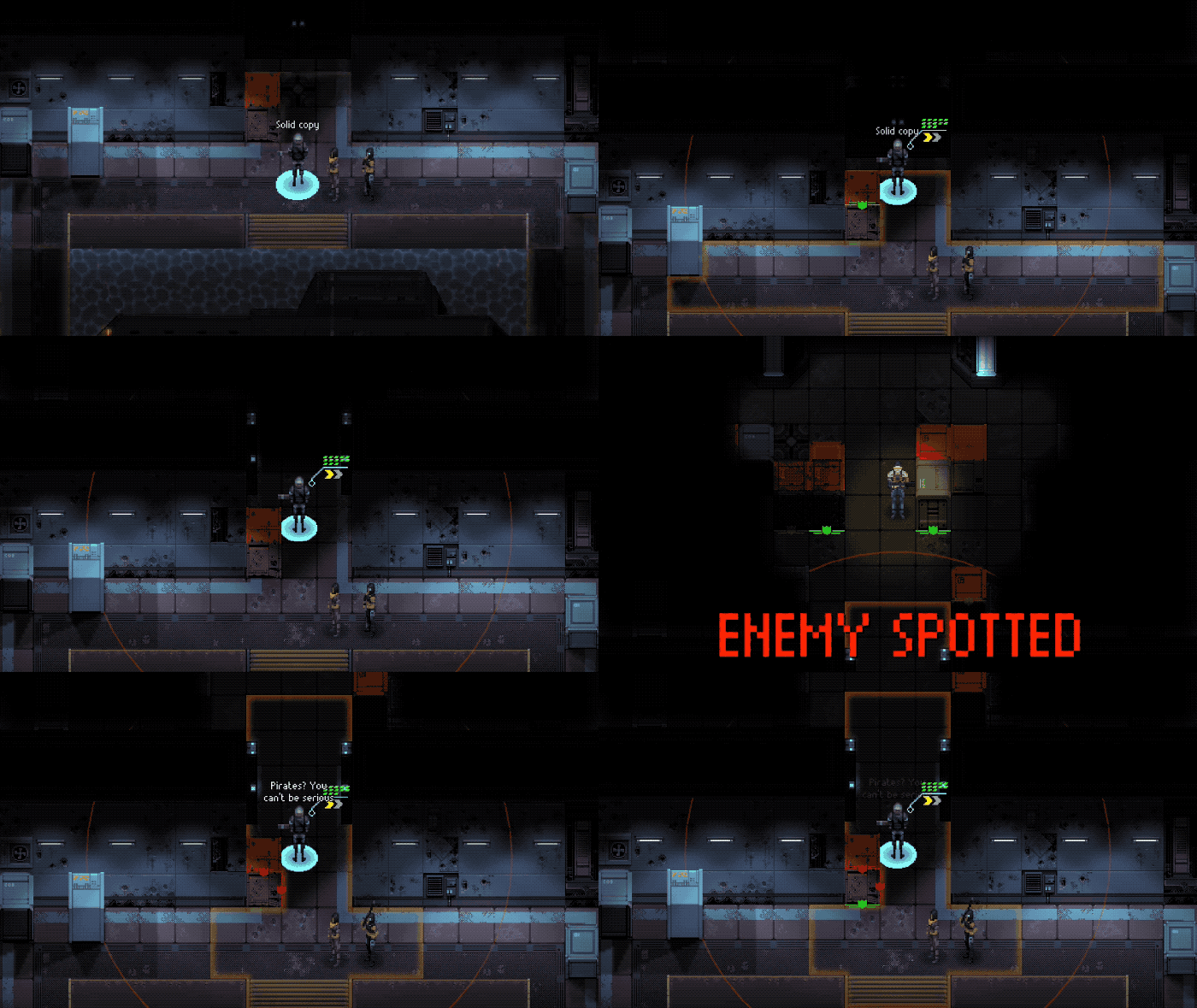
New interior facility layouts that are closed in and more complex. We also separated the facility into rooms and added doors into the picture. To open a door, just position a character next to it and click on it. Opening a door doesn’t use an action. Enemies will also open doors if they are pursuing you!

We had a lot of reports of “delays” in between turns. I guess it was something we weren't noticing... until we fixed it. Now it’s pretty obvious and the game feels much tighter. Love to get feedback on this change and if you all feel we should tighten it up even more.
It’s a Trap! Yes, you’ve seen this on the encounter text, but now this is our first “new” scenario. In a trap mission, your team spawns deep in the facility and must get back to the sub. Unfortunately for you, a lot of enemies will be hunting you. I had a lot of fun playing these and they have a very different feel since the enemy is the aggressor.
New Facility types: Farms, Reactor and Hospitals. We got a lot of new art for farms put together and some new reactor set pieces. You’ve probably seen the hospital stuff before but now we’ve made it into a cohesive level.
Missions will now "auto end" if all enemies are dead and all loot is picked up (including enemy drops).
Notifications look different now and are consistent between the mission screen and the tactical screens. They pop up on the side. We also added a new modal box to let you see what you’ve picked up on the mission. The mission screen will give you notifications when a new area is unlocked, a new sub is available or a new recruit has joined the team.
We now give you a new recruit after every completed objective.
Character voice over removed and replaced with a “text dialog” system. This is the first version, so expect to see some issues with it but I think it’s much more interesting and we are better able to customize the dialog to the character class.
New Loot and Level Up screens now only appear by clicking buttons that appear on the mission screen. The buttons will wiggle a bit to get your attention if you have a level up.
Bug Fixes
- A lot of edge cases that were giving us trouble when you completed and/or failed an objective. Hopefully these scenarios are more solid now!
- Not really a bug really, but most enemy armor couldn’t be equipped by females. We have the female version of most armors ready for female team members now. Still working on a couple, but they are for late game enemies.
- Tutorial requires selecting 3 characters
- Equipping issues that resulted in the armor having the wrong gender (male wearing female, etc) or duplicates of equipment ending up in inventory
- Issues with the out of fuel equipment sales box
- Can now revisit the boss map node if you previously said you didn’t want to do so
- Equipment not cleared from permanent characters after an objective completed
- Kill Shot skill is now working
- Double Tap skill was not working with Automatic Rifle
- Enemies no longer teleport into view
- On Windows and Linux, the game would always start in windowed. If you played previously, you may have to manually set it to full screen but it should stay there now.
- A lot of small stuff that doesn’t warrant a bullet :)
Bugs we were unable to confirm
- Had a few reports of higher level characters being removed from the team. We couldn’t confirm this and didn’t get a save file, so if this happens to you then we’d love to get that save as soon as you notice it! It’s possible that the other fixes resolved it though.
- We had a report that skill tool tips aren’t working everywhere but also couldn’t find this one. If you see something, say something!
- We’ve definitely seen some issues with the game not saving at times and are still looking into this one.
Files
Get Depth of Extinction
Depth of Extinction
Explore a flooded world in this tactical RPG
| Status | Released |
| Author | HOF Studios |
| Genre | Role Playing, Strategy |
| Tags | 2D, Pixel Art, Retro, Roguelike, Singleplayer, Strategy RPG, Tactical RPG, Turn-based |
| Languages | German, English, Spanish; Castilian, Spanish; Latin America, Japanese, Chinese (Simplified) |
| Accessibility | Color-blind friendly, Configurable controls, Interactive tutorial |
More posts
- Build 55.3 - A fix to the last fixJun 11, 2022
- 55.2 - Even More Bug Fixes!May 19, 2022
- 55.1 - More Bug FixesApr 14, 2022
- Build 55: Bug Fixes!Mar 27, 2022
- Bug fix update to Build 54Oct 04, 2021
- Build 54: Icelandic and many bug fixes!Sep 13, 2021
- Localization Update is LIVE!Apr 21, 2021
- Build 53.9: Adding Spanish and announcing ChineseMar 24, 2021
- 53.8 More fixes plus Spanish coming soon!Mar 15, 2021
- 53.7 bug fix patchMar 02, 2021

Comments
Log in with itch.io to leave a comment.
Hi,
The select the first mission, i have my Home, and 3 objectives. The GUI shows on the left side the 3 objectives, and i can click on that, or on the spot on the map, to select the objective i want to complete. But, my Home spot is also an objective, and has no GUI line for it.
The first mission/tutorial is still not doable for me. I cannot move the camera while the girl chat is open, so i must first close the chat, then move the camera to see the loot and move. I can play, but without the tutorial open.
Then, i still think there are too many layers to the maps (global, region, local...). At least one should be removed. Selecting the region, alright. Selecting the objective should be a simple screen without map, like 3 cards or documents or something. Then the next map would be already enough, but then i still have to move around a local map. It's way too much.
Also, i would really want to move my soldiers in any order i want, as i already have to deal with a sad "2 Actions" system, instead of a "Time Units" system. It's too limited, IMO. That way, i would move my soldiers as i like, then hit a "End Turn" button.
The general experience is nice, and i enjoyed so far following the progress on your game. Sure, I'd have loved a Time Units system (like Xenonauts or Enemy), organic covers (the hidden gem Enemy, from Tom Johnson, does that really well with its voxel world), more options in characters builds (deeper inventory managment, parallale base building...) but well... Maybe later.
Thanks for the feedback! I always appreciate your input.
I'm not sure why the tutorial is still giving you trouble but that's frustrating (for me and you haha). Are you clicking through the dialog rather quickly? I've seen things get thrown off then and am planning to fix that at some point (but haven't yet obviously). You should possibly be able to zoom the camera out and complete the tutorial in that case i think.
The mission maps are definitely going to be a point of emphasis in a future build. I have a few ideas for improving choosing objectives and navigating the maps that I will be working on soon. Glad to hear your take as it helps a lot to understand what's not working and/or confusing.
Time Units vs Actions.... Squad based vs Initiative System.... Inventory management.... base building.... these are tricky debates. Every game designer has to make choices when designing their game, and I think to some degree it just comes down to preference. I really enjoyed playing the original X-Com games back in the day, but the simple elegance of the XCOM:EU action and inventory system really impressed me. I also am doing most of the work myself on the game so I have to make some trade offs to be able to actually complete it :) which is the main reason I haven't attempted base building, crafting, more complex inventory management, etc. I'm hoping I can get the other stuff right enough to make the game enjoyable. Sorry if I am somewhat failing at this! But I'm trying!
I'll check out Enemy - this is the first time I've heard of it and it looks kind of weird and interesting.